What the site builder is
Your website, built from blocks on a page you can see — no code, no separate hosting.
Every website project can have its site built right in MINT. A page is made of blocks — sections, headings, text, pictures, buttons, videos, maps — arranged in rows, columns and grids. Each block has its own settings and style, and the site’s theme decides the colours, fonts and corners for all of them at once. We host the finished site for you.
Drafts and the live site. Your site always exists twice:
| What it is | |
|---|---|
| The draft | What you’re working on. Every change is saved as you go. Visitors never see it. |
| The live site | What visitors see: the version you last published. It doesn’t change until you publish again. |
So you can rework a page over several days, try a new theme or rearrange the menu without anyone seeing a half-finished site. When it’s ready, you publish once and everything goes live together.
A new website project starts with a home page (a large title, a line of text and two buttons), a header with your site’s name and a few links, and a footer — ready to change. Nothing is live until the first time you publish.
Where it opens. Open Site → Site builder in your website project and press Open the site builder — or Edit site on the website’s home. The builder opens full screen in its own tab, already signed in as you, so there’s nothing to log in to. Exit (top right) saves and takes you back to the panel. If your browser blocks the new tab, allow pop-ups for the panel and press the button again. If you stay away long enough for the builder’s session to end, it says so — open it again from the panel.
Your live site
We host it: fast pages, search-engine basics and your Site setup, with nothing to deploy.
Your published site is served by MINT on its own web address, separate from the panel, so visitors never see anything of your workspace. Connecting your own domain is on the way.
How changes reach it. Pages are kept ready to send, so they open quickly. When you publish, your site is refreshed at once: the next visitor gets the new version.
| Where it comes from | |
|---|---|
| Page title and description | Each page’s SEO. A page without its own description uses the site’s default from Site setup → SEO, and every page but the home page follows the title template there (for example “%s · Acme”). |
| Share picture and social cards | The page’s share image, or the site’s default — shown when someone posts a link to the page. Facebook, LinkedIn and X can each get their own title and words. |
| Hide from search engines | Per page (SEO → Indexing), or for the whole site in Site setup → SEO. |
| Structured data | Written into every page for Google’s rich results: the page itself (a web page, or the type you pick), its breadcrumbs, and on the home page your business’s name, logo and social links. |
| Sitemap and robots.txt | Made for you at /sitemap.xml and /robots.txt, listing the published pages that aren’t hidden from search, with each page’s priority and how often it changes, and every record a template page shows (each blog post or product) with its date and image. |
| Favicon, tracking, pixels, your scripts | From Site setup — the same settings a code-built site uses. Search-console verification and the scripts you add under Add script are in the page itself, so Google, Bing and checkers can see them. |
| Widgets | The widgets you switch on load on every page. |
Redirects. Redirects you set in Site setup work here too: someone opening the old address is sent to the new one (permanently, unless you untick it).
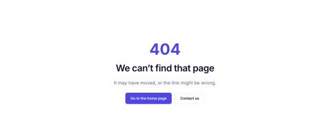
Page not found. An address with no page shows a short “Page not found” message in your site’s look, with your header and footer and a button back to the home page. To design your own, add a page at the address /404 and publish it.
Light and dark. Your site shows in light colours, dark colours, or follows each visitor’s device setting — your choice in the site’s design.
Pages
Every page of your site, where it stands, and everything you can do to it.
Open the builder (Site → Site builder in your website project, or Edit site on the website’s home). The left column has four tabs: Pages, Outline, Add and Design. Pick a page in Pages to open it.
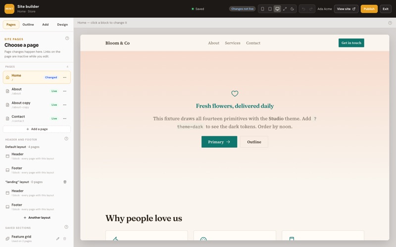
| Chip | Means |
|---|---|
| Draft | Never published — visitors can’t see it yet. |
| Live | On the site, exactly as you see it. |
| Changed | On the site, and you’ve changed it since. Visitors see the old version until you publish. |
| Off the site | You took it off. It stays off until you put it back. |
Add a page: Add, give it a name — the address fills in from the name (/about-us), and you can change it. Each page’s ⋯ menu has:
- Name, address & SEO — the page’s name, its address, whether it’s in the menu (and its label and order), whether it has the site’s header and footer, and what search engines and link previews show.
- Make it the home page — it moves to /, and the old home page gets an address from its name.
- Duplicate — a copy as a new draft, at the same address with “-copy”.
- Take off the site — after you confirm, gone from the live site at once; Put back on the site returns it with the next publish.
- Delete — a published page stays live until you publish, then it’s gone. The home page can’t be deleted.
A page’s SEO
How the page shows in Google and when someone shares its link — with a preview and checks as you type.
In a page’s ⋯ menu, Name, address & SEO. Under Search engines and sharing a Google preview shows the page as a search result while you type. Anything you leave empty uses the fallback, shown greyed in the box: the page’s name for the title, the site’s defaults from Site setup → SEO for the rest.
| Tab | What’s in it |
|---|---|
| Basics | Meta title (aim for 30–60 characters) and meta description (70–160) — the counter turns green inside the window, amber when short or close to being cut, red past it. Focus keyword (the phrase the page should rank for; never published), canonical URL (only when the page copies another) and keywords. Below them, eight SEO checks: title and description set and the right length, focus keyword set and found in both, share image set. |
| Social | Open Graph title, description and type, the share image (1200 × 630) and its alt text, and the X (Twitter) card, title, description and image. Empty: the meta title, description and share image. |
| Indexing | Allow indexing, follow links, prevent archiving, prevent image indexing, max snippet length (-1 lets Google choose) and max image preview. The defaults suit a page you want found. |
| Structured data | The schema type (auto is a web page; or Local Business, Service, FAQ Page, Article…), custom JSON-LD merged over what the site writes (one JSON object — the box says whether it’s valid; invalid is left out, never breaks the page) and the breadcrumb label used in breadcrumbs on the page and in Google. |
| Sitemap | Include in sitemap.xml, priority (0 to 1) and change frequency. |
Save the dialog; the SEO goes live with your next publish.
The same editor is in the panel under Website → SEO: one record per page, with the Google preview (on your site’s own domain), the five tabs above and, on Social, a share preview — the card a link to the page shows on Facebook, LinkedIn, WhatsApp or X. A change there comes back to the page in the builder, all of it, and goes live with the next publish.
metaTitle, metaDescription, ogTitle, ogImage, robots, sitemap… — for your own site to put in its page head.The canvas
The page in the middle is drawn exactly as visitors will see it — same blocks, same theme.
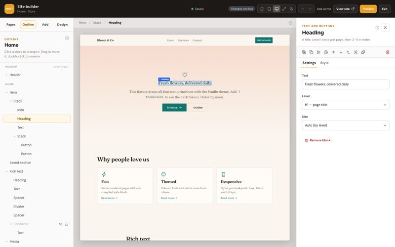
- Point at a block to see its outline; click it to select it. Its name shows on the page, and the path to it (Hero / Stack / Heading) above the page — click any part of the path to select that instead.
- Links and buttons don’t go anywhere on the canvas: a click always selects.
- The buttons at the top show the page on a phone (390 px), tablet (768 px) or desktop (1280 px), or as wide as your window. Wider pages are shrunk to fit.
- The moon / sun button previews the page in dark or light colours.
- Undo and redo (⌘Z and ⇧⌘Z, Ctrl on Windows) go back and forward through your changes; typing in one box counts as one step.
- View site opens the live page in a new tab.
Everything saves by itself a moment after you stop — the top bar says Saving…, then Saved. If you leave with something unsaved, the browser asks first.
The outline
The page as a tree of blocks — handy when blocks sit inside each other.
- Click a row to select that block; the arrow folds and unfolds what’s inside it.
- Double-click a row to give the block a name of your own (“Hero”, “Prices”) — just for you, visitors never see it.
- The eye hides a block on the site without deleting it; the lock stops it from being moved or deleted by accident.
- Header and Footer are shared by every page and listed above and below the page’s own blocks. You see them here, and change them in the header or footer itself — see Header and footer.
- Pop-ups, drawers and popovers are listed under Overlays — see below.
- Drag a row to move its block: drop it on the top or bottom edge of another row to put it before or after, or on the middle of a block that holds others to put it inside. A red line means it can’t go there, with the reason underneath.
A block’s settings
The right column shows what the selected block can do, and changes show on the page as you type. Its Style tab is how it looks — see Styling a block.
| Setting | How it works |
|---|---|
| Text | Type straight in. Rich text has a small toolbar: headings, bold, italics, links, lists, quotes and code. |
| Choices | Pick from the list — heading level, button style, size, how many columns. |
| Colours | Your theme’s colours, so a change of theme still looks right. |
| Images and videos | Pick from your media library, upload one, or paste an address. Videos also take YouTube and Vimeo links. |
| Icons | Search the built-in set and click one. |
| When clicked | For buttons, links, icons and images: go to one of your pages, open a link (optionally in a new tab), scroll to a block on the page, open or close a pop-up or drawer, or open a widget like the cart. |
The row of small buttons under the block’s name duplicates, copies, cuts, pastes, moves and wraps it (see Moving, copying and wrapping). Remove block at the bottom — or the bin in that row — deletes it (undo brings it back). Locked blocks can’t be moved or removed until you unlock them in the outline.
Adding blocks
The Add tab lists every block and ready-made section. Click one to add it, or drag it onto the page.
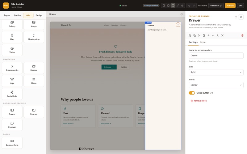
Open Add at the top of the left column. Blocks come in groups:
| Group | Blocks |
|---|---|
| Layout | Section (a full-width band), Container, Stack (a row or a column), Grid, Card, Tabs, Accordion, Spacer, Divider |
| Text and buttons | Heading, Text, Button, Link, Icon, Number, Badge, Quote, Countdown |
| Pictures and video | Image, Gallery, Carousel, Moving strip, Video, Map, Embed (a map or video from an allowed site) |
| Navigation | Header, Logo, Menu, Social links, Breadcrumbs |
| Pop-ups and drawers | Pop-up, Drawer, Popover — see below |
| Forms | Contact form |
Click a block to add it next to what’s selected: into it, if it’s a block that holds others (a section, a stack, a grid), otherwise just after it. With nothing selected it goes at the end of the page. A whole section — a ready-made one, a saved one or an empty section — asks first: you see it and choose where it goes (after the selected section, at the top or at the end of the page), and the page scrolls to it once it’s added.
Drag a block onto the page to put it exactly where you want: a blue line shows where it will land, and an empty box turns blue when it will go inside. If a block can’t go somewhere, a red note says why and nothing is added. The search box at the top finds blocks and sections by name. What each block does is in Every block.
Ready-made sections
Sections at the top of the Add tab are whole parts of a page, built from ordinary blocks.
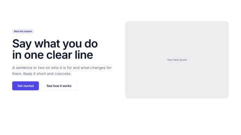
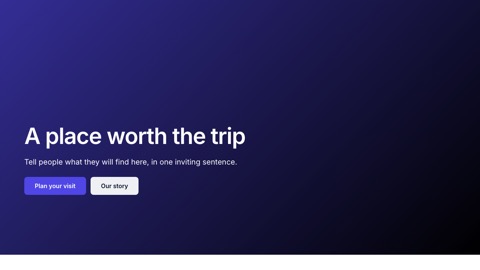
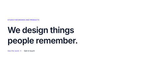
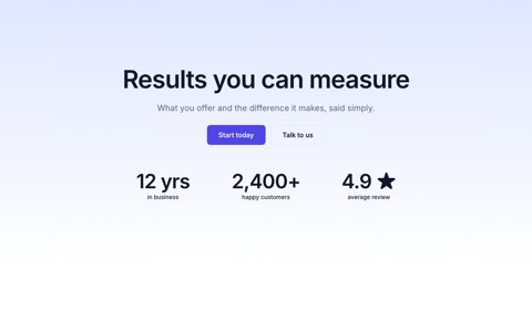
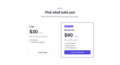
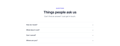
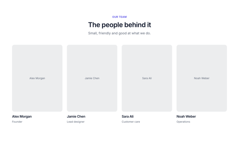
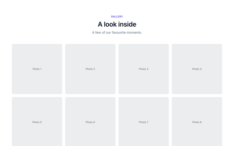
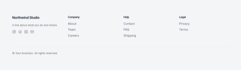
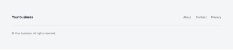
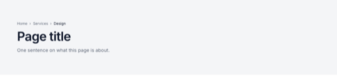
A ready-made section — a header, a hero, prices, questions, a footer — is a set of blocks arranged for you. Add it like a block (click, or drag it onto the page): it goes between the page’s sections. Once it’s on the page it’s just blocks: change any text, picture or button, add or remove parts, move them around. Each one takes your theme’s colours, fonts and corners, so it fits the rest of the site straight away.
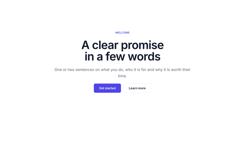
The Add tab shows a small picture of each. They are grouped like this (the pictures below are the sections as they come, in the Studio theme):
Headers
Your logo or name and a menu of your pages; on phones the menu folds into a ☰ button.




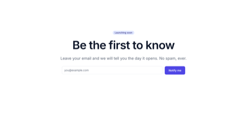
Heroes
The big first section of a page.
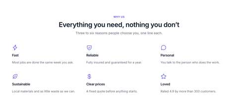
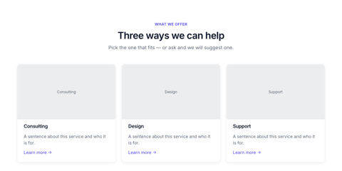
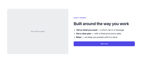
Features and services
What you offer and why people choose you.
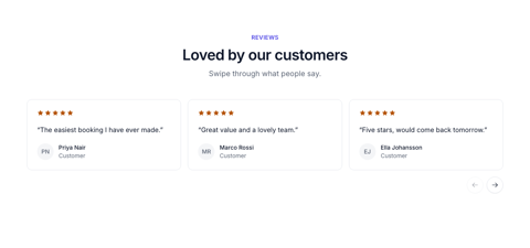
Proof
Logos, numbers and what customers say.


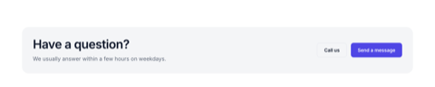
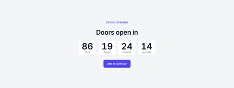
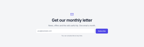
Calls to action and events
Ask for the next step.

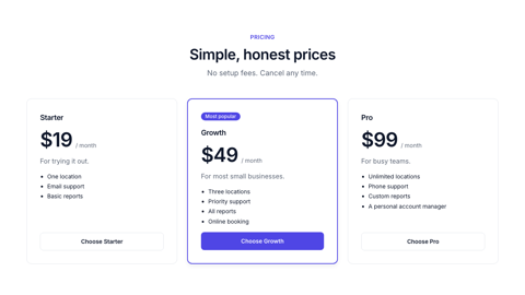
Prices and questions
Plans side by side, and answers that open on a click.
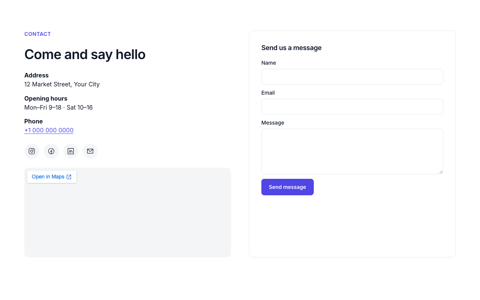
People, pictures and contact
Your team, a gallery, how to reach you.
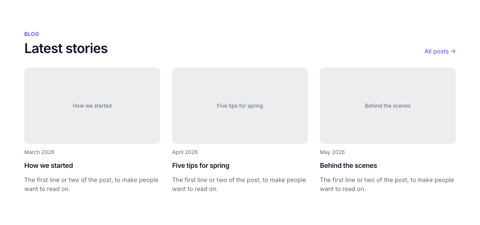
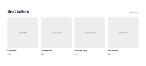
Blog and products
Sample posts and products for now — they’ll show your own soon.
Footers and whole pages
The bottom of every page, a page title, and a “page not found” page.

Moving, copying and wrapping
Move blocks by dragging them, or with the buttons and shortcuts; copy them to any page.
- Drag on the page: select a block, then drag its blue name tag. The blue line shows where it will go; let go to drop it. Press Esc to cancel.
- Drag in the outline: see The outline.
- Move up / down (⌥↑ / ⌥↓) swaps it with the block before or after it.
- Duplicate (⌘D) puts a copy just after it.
- Copy (⌘C) and Cut (⌘X) keep it to paste; Paste (⌘V) adds it next to the selection — on this page or any other page of any of your sites, in this browser.
- Wrap puts the block inside a new stack or section, so you can lay it out with others or give it a background.
- Select the block it’s in (Esc) walks up from a block to the one holding it.
Copies get new ids, so they never clash with what’s already on the page. If a copied button opens a pop-up that you didn’t copy with it, the editor warns you before publishing.
Typing on the page
Double-click a heading, text, button or link on the page to type straight into it.
- Double-click the words. They become editable right where they are.
- For a heading, button or link, press Enter to finish. For text with several paragraphs, Enter starts a new line — finish with ⌘Enter or by clicking somewhere else.
- Esc stops without keeping the change.
- In text blocks, ⌘B and ⌘I make words bold or italic. Anything else pasted in is tidied to the formatting the site allows.
The same text is in the block’s settings on the right — change it in either place.
Keyboard shortcuts
They work whether the page or the outline has the focus — not while you’re typing in a box.
| Keys (Ctrl on Windows) | What it does |
|---|---|
| ⌘Z / ⇧⌘Z | Undo / redo |
| ⌘C · ⌘X · ⌘V | Copy · cut · paste |
| ⌘D | Duplicate |
| Delete or ⌫ | Delete the selected block |
| ↑ / ↓ | Select the block before / after |
| ⌥↑ / ⌥↓ | Move the selected block up / down |
| Esc | Select the block it’s in |
| Double-click | Type on the page |
Pop-ups, drawers and popovers
Things that open over the page when a button is clicked: a sign-up pop-up, a side menu, a small note.
| Block | What it is |
|---|---|
| Pop-up | A window in the middle of the screen. Good for a sign-up form, a video, more details. |
| Drawer | A panel that slides in from the left or right. Good for menus, filters, a cart. |
| Popover | A small panel that opens just under the button that opens it. Good for short notes and mini menus. |
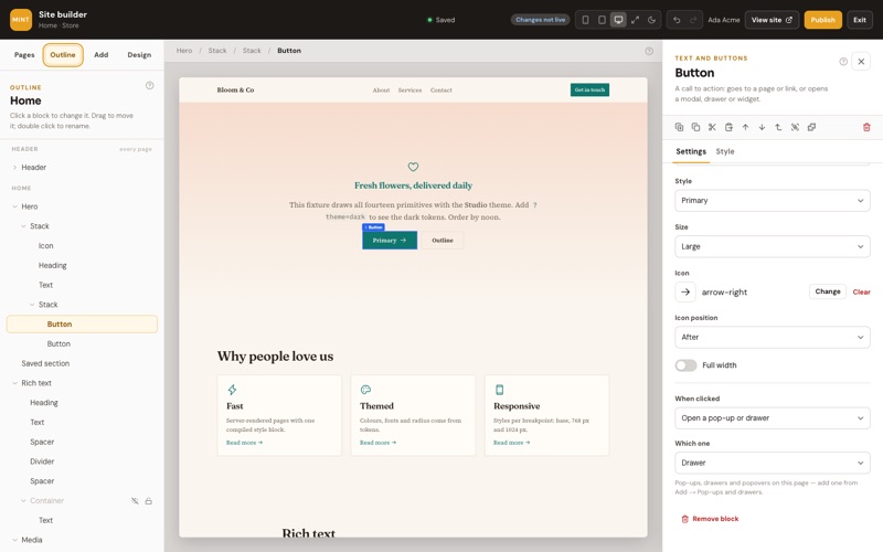
- Add one from Add → Pop-ups and drawers. It goes at the top level of the page and is listed in the outline under Overlays.
- Put anything inside it — text, pictures, buttons — like any other part of the page. While it (or something in it) is selected, it shows open on the canvas.
- Select the button or link that should open it, and set When clicked to Open a pop-up or drawer and pick it under Which one. Toggle opens it or, if it’s open, closes it; Close is for a button inside it.
- Publish.
On your site they stay hidden until opened. A pop-up or drawer dims the page behind it and closes with its × button, with Esc, or with a click on the dimmed page; the keyboard stays inside it while it’s open, and screen readers announce it by the name you give it in its settings. A popover closes with Esc or a click anywhere else.
Styling a block
Select a block and open Style in the right column: spacing, size, background, border, text and more — all from your theme.
| Group | What it changes |
|---|---|
| Layout | For blocks that hold others: side by side or stacked, wrapping, how items line up and spread out, the gap between them, grid columns. |
| Spacing | Padding (space inside the block) and margin (space around it), side by side, in the steps of your theme’s spacing scale. |
| Size | Width, maximum width (reading width, page width …), minimum height, height and shape (square, 16:9 …). |
| Background | A theme colour, a gradient between two theme colours, or an image — with a colour laid over it to keep text readable. |
| Border | Line width and colour, rounded corners and shadow, from your theme. |
| Text | Size, weight, alignment, colour, line height, letter spacing and capitals. |
| Effects | Opacity, sticking to the top while scrolling, which block sits on top, and which screen sizes the block shows on. |
Only what applies is shown: line-up and gap settings appear for blocks that hold others, image settings once there’s an image. Groups with something set have a dot. Colours are always your theme’s colours, never a fixed one — so when you change the theme or a colour in it, every block follows.
Phone, tablet and desktop
A style can be different on a phone, a tablet and a computer. Phone comes first; bigger screens only change what you set for them.
- The Phone, Tablet and Desktop buttons at the top of the Style tab are the same as the ones above the page: picking one shows the page at that size and edits the styles for it.
- Phone styles apply on every screen. Tablet styles apply from 768 px wide and up, Desktop from 1024 px — each only for what you set there. A setting you leave alone shows what it gets from the smaller size, like “As on phone (large)”.
- A blue dot next to a setting means it’s set for the size you’re editing; click it to clear it there. An orange ring means a bigger size changes it; click it to drop those changes.
- The circling arrow beside the sizes clears every style set for the size you’re on. The number on each size button says how many it has.
- To hide a block on some screens only, use Effects → Shown on and click the sizes it should be hidden on.
Theme, colours and fonts
The Design tab sets the look of the whole site at once. Your pages and their words never change.
- Theme. Pick one of the themes — each has its own colours, fonts, corners and buttons. Every page restyles straight away; nothing on them is lost or moved.
- Light and dark. Show visitors the light colours, the dark ones, or follow their device. The moon button above the page only changes your preview.
- Colours. Change any of the theme’s colours, for light and for dark — the primary colour, text, backgrounds, lines. The arrow next to a changed colour puts the theme’s back.
- Fonts. Pick the font for headings, for text and for code from about 50 Google Fonts, each shown in its own face, or use the device’s own font.
- Shape. Corners (sharp to round), shadows (flat to deep) and how wide the page’s content gets.
- Buttons. Their corners, how bold their text is, and whether it’s in capitals.
Your changes are kept on top of the theme: pick another theme and they stay. Reset to the theme drops them all. The design saves by itself like a page, and goes live with the next publish. While you’re in the Design tab, undo (⌘Z) steps back through design changes; on a page, through that page’s.
The themes
Seven themes, each a different mood. Every one works in light and dark, and you can change any colour or font.
| Theme | Look and fonts |
|---|---|
| Studio | Clean and modern — neutral greys and an indigo accent. Fits most business sites. Fonts: Inter. |
| Editorial | Warm and literary — paper tones and a terracotta accent. Writers, studios, restaurants. Fonts: Fraunces, Source Serif 4. |
| Bright | Friendly and colourful — violet and coral, round corners, pill buttons. Apps, shops, classes. Fonts: Outfit, DM Sans. |
| Market | Fresh and trustworthy — deep green and warm amber. Made for shops and products. Fonts: Manrope. |
| Calm | Soft and unhurried — sage and sand, generous space, round corners. Bookings, wellness, care. Fonts: Lora, Nunito. |
| Mono | Stark and precise — black and white, square corners, capital buttons. Portfolios. Fonts: Space Grotesk, IBM Plex Sans. |
| Bistro | Warm and inviting — wine red, brass and cream. Restaurants and bars. Fonts: Playfair Display, Lato. |
Pick one in Design → Theme and the builder asks what you want:
| Choice | What happens |
|---|---|
| Load the demo site | A whole site in that theme to start from: a home page and three or four more, a list that suits the theme (a menu for Bistro, services for Studio, products for Market, classes for Calm, posts for Editorial, work for Mono, features for Bright) with sample records, and every text saved in your Contents so you can rewrite it here or in the panel. See Your data on the page. |
| Replace with the demo | The same, on a site that already has pages: they’re replaced (the home page keeps its place). Nothing changes on the live site until you publish. |
| Only change the look | Every page is restyled at once; your words, pictures and layout stay as they are. |
Colours and fonts you changed stay on top of whichever theme you pick (see Theme, colours and fonts). The theme and its colours are also kept in your project’s Site design record, so they can be changed from the panel too — the builder picks the change up the next time it opens.
Header and footer
The header and footer are shared: change them once and every page shows the change.
- Open Pages and click Header or Footer under the list of pages — or select a block of the header on a page and press Edit the header. Delete it there removes that block from the header on every page (it asks first, then opens the header so undo brings it back).
- The header (or footer) shows on its own on the canvas. Add, move, style and type in it exactly like on a page. The bar above the page says how many pages show it.
- Go back to a page with the arrow in that bar, or by picking the page.
Another layout. A page uses the site’s header and footer, or none (in the page’s settings, under Header and footer). For a page that needs a different header — a landing page, say — press Another layout under the header and footer, name it, change its header and footer, and pick it in that page’s settings. A layout pages still use can’t be deleted.
Saved sections
Save a part of a page as a section and use it on as many pages as you like. Change it once and every page follows.
- Select the block to save — usually a whole section, like a sign-up band or opening hours — and press the puzzle piece in the row of buttons under its name: Save as section. Give it a name. It takes that block’s place on the page.
- To use it on another page, open Add: your saved sections are at the top. Click one or drag it onto the page.
- To change it, select it on any page and press Edit the section (or click it under Pages → Saved sections). The bar above the page says how many places use it — the change shows in all of them when you publish.
- To change it on one page only, press Detach a copy: that page gets its own copy of the blocks, no longer linked.
Under Pages → Saved sections you can rename one, or delete one no page uses. A saved section can’t hold another saved section, or a pop-up or drawer.
Every block
What each block on the Add tab is for, in one line.
Layout
| Block | What it’s for |
|---|---|
| Section | A full-width band of the page with its content kept to a readable width. Pages are made of these. |
| Container | Keeps what’s inside to a maximum width, centred. |
| Stack | Lines blocks up in a row or a column with even gaps. Rows turn into columns on phones. |
| Grid | Equal columns — fewer on tablets and phones. |
| Card | A box for a picture, text and buttons. The whole card can be a link (then leave buttons out). |
| Tabs | Content in tabs: visitors pick a title to see its part. Each tab is a block inside it. |
| Accordion | Questions that open to show their answers. Can keep just one open at a time. |
| Spacer, Divider | Empty space of a set height; a thin line. |
| Saved section | A section you saved to use on several pages — see Saved sections. |
Text and buttons
| Block | What it’s for |
|---|---|
| Heading | A title. One main title (level 1) per page, then levels 2–4 in order. |
| Text | Paragraphs with bold, italics, links and lists. |
| Button | Goes to a page or a link, scrolls to a block, or opens a pop-up, drawer or widget. |
| Link | A text link to a page, another site, an email address or a phone number. |
| Icon | One of about 200 icons, in the text colour. |
| Number | A big figure with a label — “12 years”, “4.9 ★”, “2,000 customers”. |
| Badge | A small label — “New”, “Popular”, “Sold out”. |
| Quote | What a customer said, with their name, role, photo and stars. |
| Countdown | Days, hours, minutes and seconds to a date; shows your own message once it has passed. |
Pictures and video
| Block | What it’s for |
|---|---|
| Image | A picture from your media library, cropped to a shape if you like. |
| Gallery | A grid of pictures; a click opens them big, with next and previous. |
| Carousel | Slides people swipe or step through with arrows — pictures, cards, quotes. |
| Moving strip | Logos or words that slowly scroll sideways; it stands still for people who prefer less motion. |
| Video | A YouTube or Vimeo video, or a video file — can play silently on a loop. |
| Map | A Google map of your address from Site setup, or one you type in. |
| Embed | A map or player from an allowed site by its embed link. |
Navigation
| Block | What it’s for |
|---|---|
| Header | Logo, menu and buttons at the top of every page; on phones the menu opens from a ☰ button. |
| Logo | Your logo and/or site name, linking to the home page. |
| Menu | A row or column of links: your menu pages, or links you choose. |
| Social links | Icons for your social profiles from Site setup, plus your email. |
| Breadcrumbs | Home › Section › This page — from the page’s address. |
Pop-ups, drawers and forms
| Block | What it’s for |
|---|---|
| Pop-up, Drawer, Popover | Panels that open from a button — see Pop-ups, drawers and popovers. |
| Contact form | Name, email and message. Until built-in forms arrive, sending opens the visitor’s email app, addressed to the email in Site setup. |
Blocks that use your Website settings. The header, logo, social links, map and contact form show your site name, logo, social profiles, address and email from Site setup — change them there and every page follows. The header’s and menu’s links are the pages you marked Show in the menu (or links you type in, if you choose “These links”).
Hints, not errors. Some things are flagged with a hint but never stop you publishing: a picture without alt text (a short description for people who can’t see it), a second main title on a page, or a heading that skips a level. Fixing them helps visitors who use screen readers, and search engines.
Your data on the page
Your site’s words, lists and details live in your project, where the team can change them without opening the builder.
| What | Where it lives |
|---|---|
| Texts, headings, buttons, pictures | Contents — one record per section, of the section’s type (a Hero, Cards, Questions…), with a short name (its slug) such as home-hero-1, made for you. Edit them on the page or in the panel’s Contents; a change is a draft until you publish — the site’s Publish, or Publish in Contents. |
| Cards — features, team, reviews, numbers | Contents — the section’s record, its cards as its rows. |
| Each page’s title and description for search engines | SEO — one record per page. Changing it in the panel shows on the page in the builder and goes live with the next publish. |
| The theme, colours and fonts | Site design — one record. See The themes. |
| Lists — services, team, products, posts… | A model of its own with a public API (list and get) switched on, so visitors’ pages can read it. |
Every word is in Contents, from the start. A new site opens as its theme’s demo — every page, its SEO record and a list such as Services — named after your site. Each heading, text, button and picture on it is already a Contents record, and so is everything you add later: a section or block from the Add tab arrives with demo words (rich text as lorem ipsum) saved in its own record, and a pasted or duplicated copy gets records of its own. Each section’s words are one record of the section’s type — the hero’s heading, text and buttons together — so the panel’s Contents shows a page piece by piece, in its order. Change the words right on the page or in the panel; a setting kept in Contents shows In Contents · Open beside it. Changes are drafts: Publish puts the layout and its words live together.
Lists of cards. Sections made of look-alike cards — features, team, reviews, numbers, steps — are lists: their cards are kept in one Contents record. Select the list (click a card, then List of records in the path at the top) and change, add, remove or reorder the cards under Records, or in the panel’s Contents.
Use data. Text, pictures and buttons that can come from data show a small Use data button beside their setting. Pick a Contents record, the site’s name, email, phone or address, or — inside a list — a field of each record. The setting then shows where its value comes from; stop using data to type it here again.
Lists of records. Any list can show one of your models instead of its own cards: under Records pick the model (Services, Team, Products…), the order, how many, and — if you want only some — a filter (featured is yes, price at most 100…). The card follows: its title shows the record’s name or title, its text the description, its picture the image. Pick Cards kept in Contents to go back to cards of its own. The blocks inside the list are drawn once per record: bind them with Use data, or type {{item.title}} in a text. Turn on Show pages for Previous / Next links when there are more records.
A page for each record. A page whose address has a part in brackets, like /services/[slug], shows one record: /services/web-design shows the service whose slug is web-design, and its title and description can use the record too ({{record.title}} — Acme). An address with no such record is a “page not found”.
Text can format what it shows: {{item.price | money}}, {{record.createdAt | date}}, {{item.summary | truncate:120}}, {{item.subtitle | default:'Coming soon'}}; also number, upper and lower.
Build with your own AI
Connect Claude, ChatGPT, Cursor or any MCP client, and let it build the site here — with the same pages, themes and checks as the builder.
Open AI in the builder’s top bar (or Settings → Connect your AI):
- Connect — make a key (it acts as you, never beyond your role; tick It may publish only if you want your AI to put changes live), then follow the steps for your AI with the key already filled in.
- Build with AI — a ready request with your theme in it. Copy it into your AI; in Claude and Claude Code it’s also in the prompt menu as “Build my site”.
- Keys — every key, when it was last used, and Revoke.
Your AI starts from the theme’s demo site when the site is blank, writes your words into Contents, makes a model for each list (with its public API on) and fills it, and saves every page with its SEO. Everything it makes is a draft you see and change in the builder; nothing goes live until you publish (or it does, if its key may publish and you ask it to). More about keys and clients in Connect your AI.
Publishing
One button puts every change live at once, and each publish is kept as a version you can go back to.
Press Publish at the top right of the editor. What Publish does. It first checks the whole site. If something would break a page — a button that opens a pop-up you’ve since deleted, a link to a page that’s gone — Publish stops, nothing changes on the live site, and you see each problem; click one to jump to its page and block. Fix them and publish again.
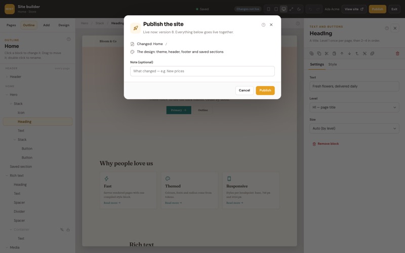
When everything is in order, it puts live together:
- Every page you added or changed since the last publish.
- The look: theme, colours and fonts, the header and the footer, and your saved sections.
- Pages you deleted disappear from the live site.
Visitors see the new version within moments. You can add a short note (“New prices”, “Summer menu”) so you know later what each version was.
| Doing this | Happens on the live site |
|---|---|
| Editing a page | Nothing, until you publish. |
| Deleting a page | It stays live until you publish, then it’s gone. The home page can’t be deleted — make another page the home page first. |
| Taking a page off the site | It goes off the live site at once, without publishing, and stays off when you publish other changes until you put it back. |
| Renaming a page or changing its address | The live page keeps its old name and address until you publish. |
History. Each publish is a numbered version: who published it, when, and its note. Going back to an earlier version makes it live again straight away and puts your drafts back to it too — it’s saved as a new version, so you can always come forward again. Pages you made after that version are kept as drafts, off the live site. The last 50 versions are kept.